Improving the user experience for employees worldwide
Company
C+ GROUPE
Place
Paris
Project type
Digital Asset Management tool
Status
Completed
Date
Sept. 22 – Ju. 2024
Context
Like any company with strong international visibility, C+ must ensure a consistent brand image across social media, websites, online and print communication campaigns. This need also includes improving the user experience (UX) for team workers as they manage graphic assets of the brand.
The challenge is multifaceted: controlling brand ownership, ensuring its correct usage, and addressing cultural and local specifics within the C+ brand framework.
Issue
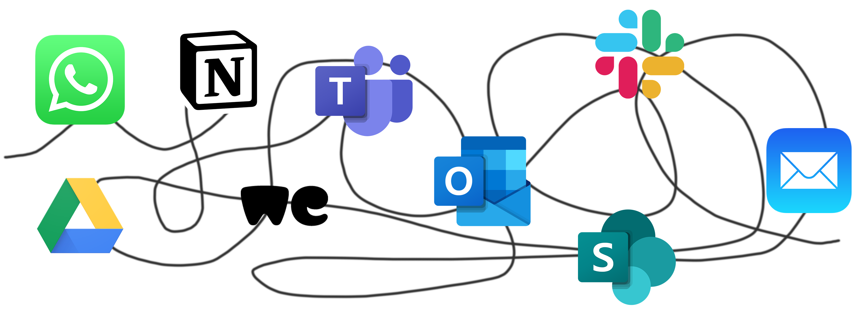
The dispersion of graphic resources
Until now, there was no tool to centralize the graphic elements of the group’s brands.
Resources were spread across many different platforms, leading to duplicate creations and the use of outdated data.
There was no identified point of contact for sharing and communicating resources.
Solution
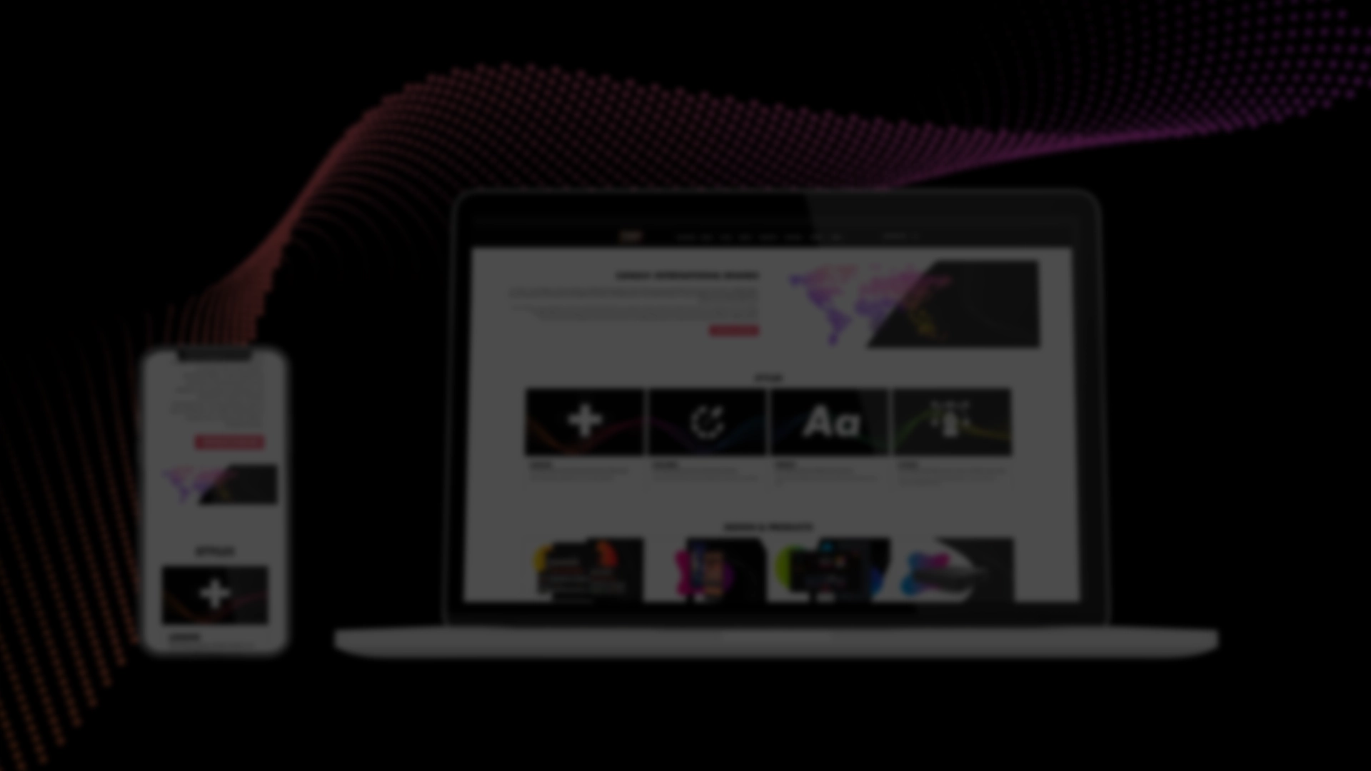
We designed and implemented a corporate Digital Asset Management (DAM) solution aimed at centralizing and harmonizing all brand assets and ensuring visual consistency on an international scale. This secure platform provides employees with access to all information, guidelines, visuals, and graphic resources for the C+ brands. The site is in English to ensure accessibility for employees in different regions. The platform is intended to become the reference tool for all employees, ensuring compliance with brand identity. With the integrated newsletter, employees will be kept informed of updates to the assets.
UX Research
User Research
Over a period of two months, we conducted a survey on user needs with a sample of around 100 employees to explore and gather their expectations. This helped us validate the relevance of our project before implementation, anticipate future user behaviors, understand their perspectives, and engage them in the design process.
We started by creating a list of people to interview based on job role, position, and their localization across various subsidiaries in France and abroad.
We then designed and sent a survey to this group. The results allowed us to collect quantitative data and generate statistics on employees’ usage patterns and challenges related to retrieving and using elements like logos, fonts, brand guidelines, icons, presentation templates, etc.
We also conducted interviews of employees to delve deeper into their needs, understand their opinions, and identify their pain points. These interviews allowed us to gather “critical incidents,” which refer to significant events that impacted the interviewees’ work, whether positive or negative. Analyzing these incidents was key to improving the user experience and optimizing the solution.
We analyzed the data and developed primary and secondary personas.
User Journey
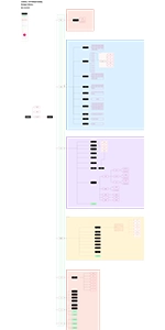
Site map
The platform’s structure must ensure a user journey aligned with the needs and profiles of the users. Several constraints needed to be considered:
- Access to content by territory, role, and brand.
- Sections dedicated to brand elements, the most frequently requested assets identified during the UX research phase.
- An architecture that reaches down to the content block level.
- Consideration of rights and permissions at the content block level.
We also had to adapt to the technical structure of the tool provided by the vendor.
The structure was designed using Figma.
User flow
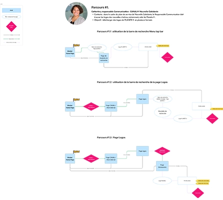
Once the structure was validated, we created user flows. This step is essential for designing a smooth and intuitive user experience. User flows map out each step users will take to accomplish specific tasks within the Design Library, providing a clear visualization of their journey.
These flows allowed us to anticipate user needs and potential friction points, as well as identify different interactions users might have, laying the foundation for the design of platform features.
We created user flows based on the needs of each role, inspired by real-life use cases.
User Interface
Wireframes
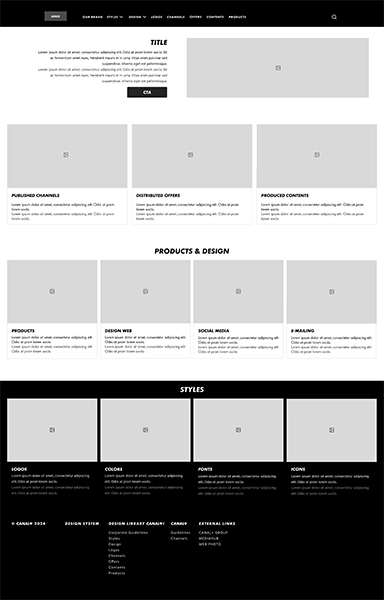
To create the wireframes, we relied on the user interface structure of the CMS pages to make the sketches as realistic as possible.
We conducted an audit of other brands using the same CMS and also tested the tool on a “test” account. All pages were designed on Figma.
Visual Identity
Graphic Concept
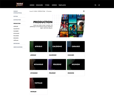
The art direction draws from the ANONYME brand’s graphic concept. It is a creative concept that is expressed in various forms:
- Adaptations for the platform’s different sections.
- Solid or gradient colors.
- Black and white.
- Layering of images and interplay between foreground and background.
- Geometric shapes.
UX Evaluation
User Test
User tests were conducted over two months with a panel of employees from various roles, one-third of whom were from subsidiaries abroad.
Test Scenarios
We developed user journeys tailored to the needs of each employee. Asking users to retrieve a specific asset they actually need piqued their interest and highlighted the necessity of the platform for the target audience.
Methodology
- We gathered data to identify issues related to user journeys, the user interface, functionality, and overall understanding of the platform’s offerings.
- We observed user behavior in real-world usage contexts and identified challenges and best practices.
- The tests allowed us to measure:
- Effectiveness: We defined objectives for the user to achieve.
- Efficiency: We provided users with a framework and resources to accomplish these goals, including a limited time frame.
- Satisfaction: We considered both positive and negative feedback from users on ergonomic and aesthetic aspects.
User Test Results
The feedback was overwhelmingly positive. However, the tests also highlighted some frustration points, which we subsequently addressed.
