Redesign of the website to optimize the user experience
Company
C+ INTERNATIONAL
Place
Paris
Project type
Business to business website
Status
Completed
Date
Sept. – Dec. 2024
Context
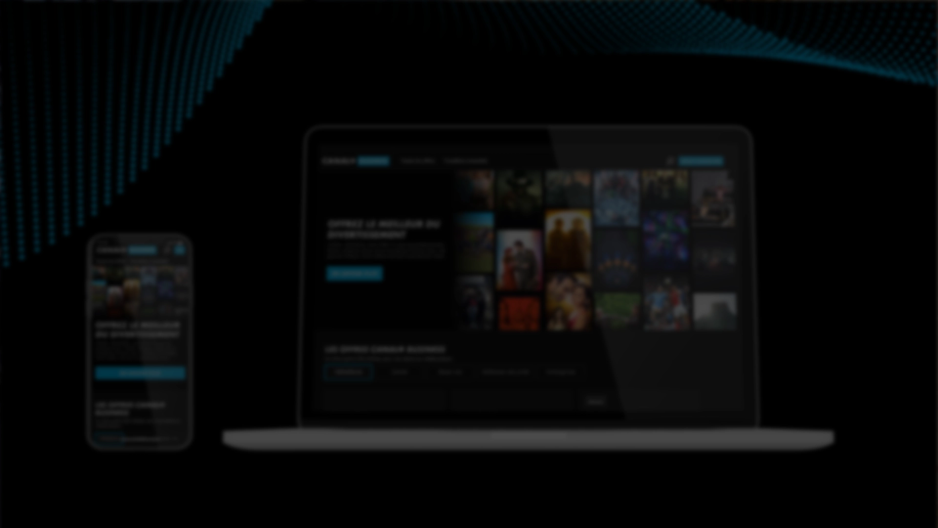
C+ BUSINESS AFRIQUE aims to attract more leads through its website, make it more appealing, and clarify its online offering.
To achieve this project, we worked closely with the Business teams to gather the requirements, Marketing teams for analytical data and targets, and developers and webmasters to address technical constraints.
Digital analytics
User Behavior Analytics
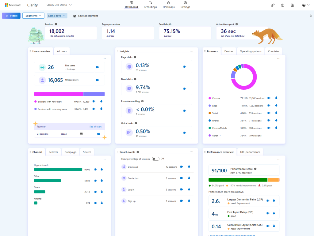
We started by conducting a UX audit of the existing website. We analyzed the interfaces, site structure, and user journeys, then cross-referenced this data with user behavior analytics.
On Microsoft Clarity and Amplitude, we collected data from the last three months, the past month, and the last three days, to identify emerging trends.
In terms of metrics, we gained insight into the number of unique users and were able to quantify the share of new users versus returning users. We identified their location, as well as the browsers and operating systems they were using.
In terms of user journeys, we reviewed referrers (browsers, third-party sites, etc.) and channels (organic search, direct access, etc.). The keywords used in browsers to access the site gave us insights into the needs of prospects. “Rage clicks” and the most visited pages helped us pinpoint areas of user frustration and identify common user paths.
We found that 9 out of 10 users visited the site via mobile, emphasizing the need to build a mobile-first user journey and interface.
UX Benchmark
Competitive Analysis
We conducted a UX benchmark, focusing on the websites of competing brands targeting a similar audience to ours.
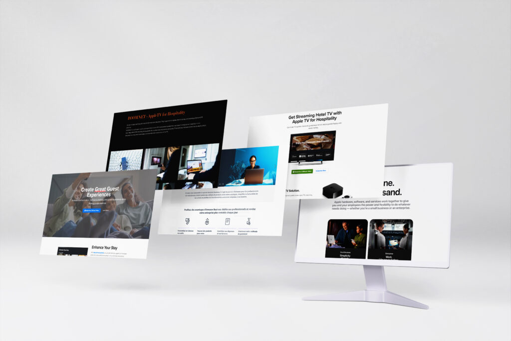
User experience practices vary between B2B and B2C, depending on user age groups. Expectations also differ based on the type of platform (e-commerce site, showcase site, etc.). The competitive analysis allows us to ensure that our offering meets the industry-specific standards.
Studying and testing competitors’ actions also helped us identify what works effectively in terms of UX.
Through this UX benchmark, we observed that many competitors had adopted certain popular features, thereby enhancing the user experience.
User Journey
Site Architecture
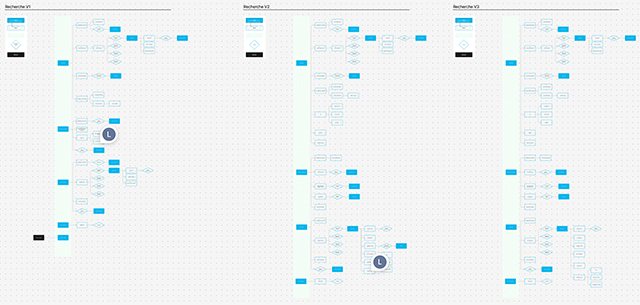
We recreated the existing site architecture in FigJam to assess its scope and identified frustration points in the user journey. This work, combined with prior research, allowed us to build a structure that provides a smoother user experience.
User flow
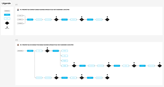
We developed user flows tailored to our target audience’s needs. We mapped out the steps users follow to complete a task, clearly visualizing their journey.
These user flows enabled us to anticipate user needs and potential friction points, as well as identify different interactions they might have. This provided a solid foundation for interface design.
User Interface
Design System
We utilized the company’s design system to ensure visual consistency across pages and maintain brand identity. We created a brand-specific color palette using Figma variables.
We follow an Atomic Design methodology to develop scalable interfaces.
- Atoms are the simplest UI elements, such as buttons, colors, and typography styles.
- Molecules are groups of atoms forming coherent UI components.
- Organisms consist of multiple molecules and/or atoms grouped together.
- Templates represent the structure of different molecule groups.
- Pages define the final user interface.
Mobile-First Approach
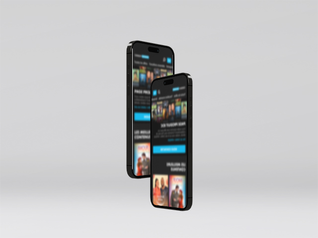
Based on analytical data gathered beforehand, we adopted a design approach optimized for mobile devices. In this process, the page is first designed and optimized for mobile screens before being progressively adapted for desktop browsers. This approach aligns with search engine trends, such as Google’s prioritization of mobile-friendly sites in search rankings.
