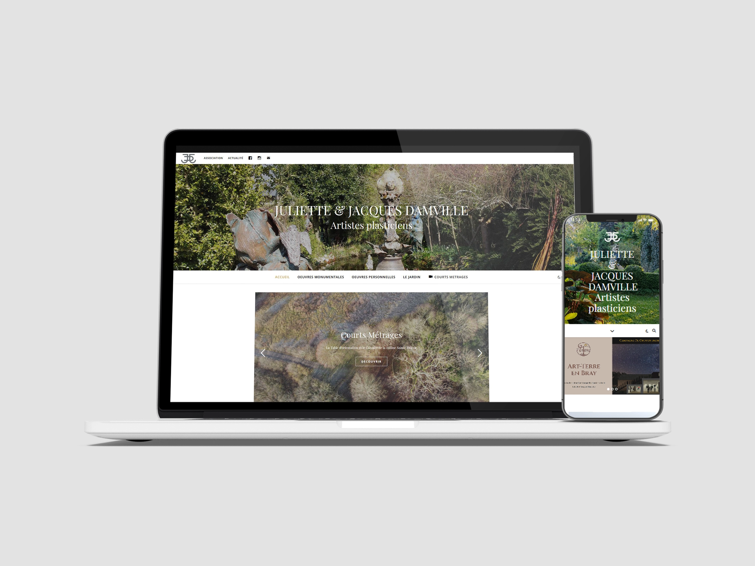
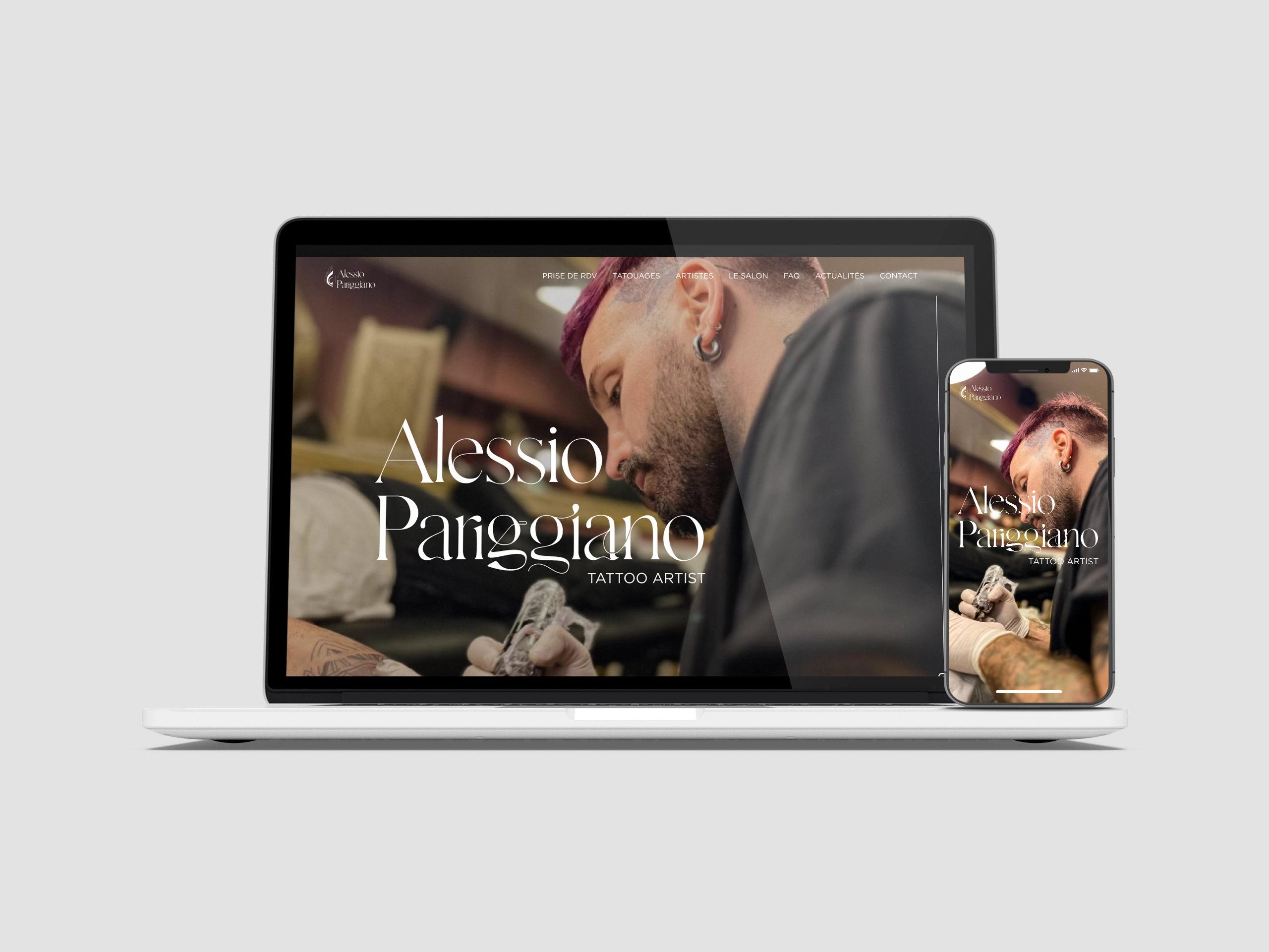
e-shop website creation
Company
Arte Fact
Place
Bordeaux
Project type
e-shop website
Status
Completed
Date
May 2020 – Jan. 2021
Context
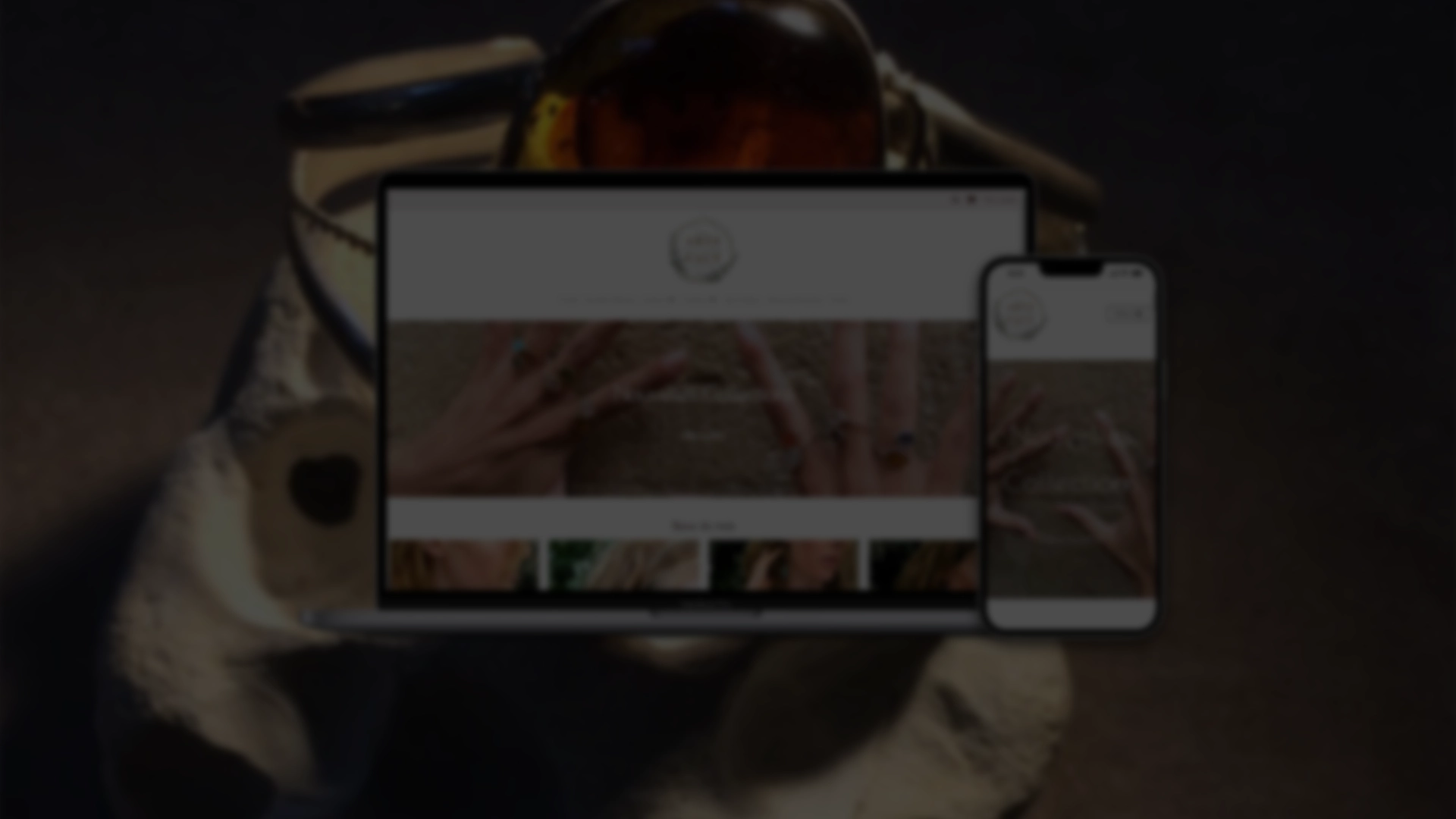
Arte Fact is a creator jewelry boutique located in Bordeaux. In 2020 and 2021, the health crisis due to the COVID-19 virus forced Arte Fact to close temporarily and adapt using other sales channels. I supported the boutique’s digital transformation by creating its e-shop website and revisiting its visual identity.
Design & Logo
Visual identity
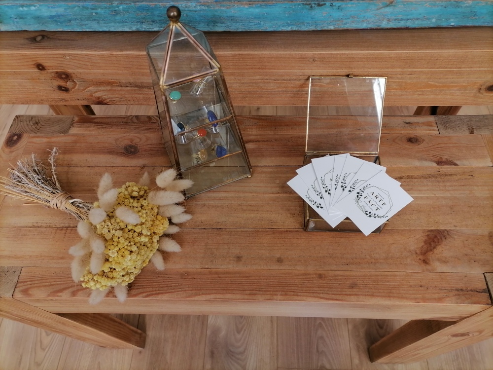
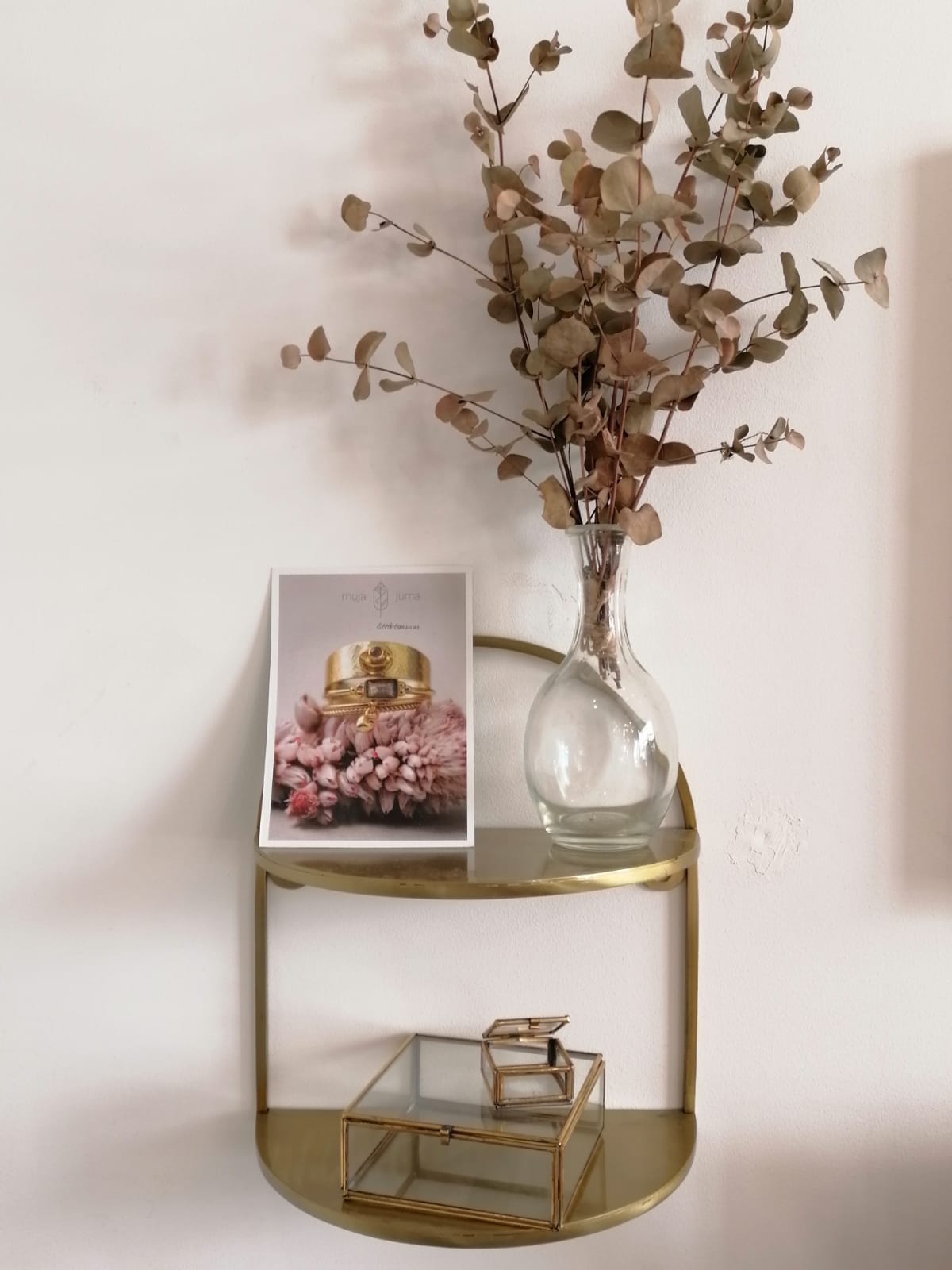
The creation of the e-shop site started with a definition of the graphic identity. It has to match with the decoration and style of the store, hence the importance of maintaining visual unity for customers and users.
Logo
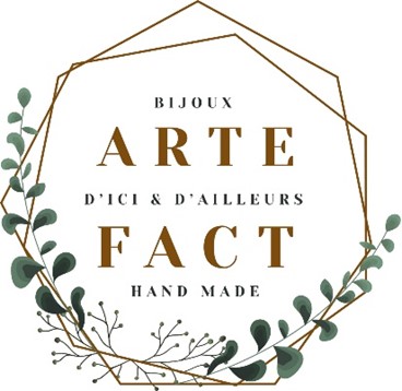
The Arte Fact logo combines the colors and values of the brand: brown refers to the handmade and artisanal side of jewelry creation; green refers to the natural and mineral, semi-precious stones used.
It reflects the spirit of the Arte Fact brand: offer customers unique, hand-crafted creations based on the original know-how of French and foreign designers.
The hexagonal shape of the logo adds a dynamic, reassuring note. The logo evokes a stamp, a nod to the authenticity of the brand and its offering.
Colors
I used a brown palette to highlight elements on the site.
Primary Color
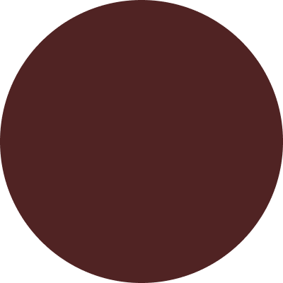
Dark Bordeaux
#502323
Secondary Color
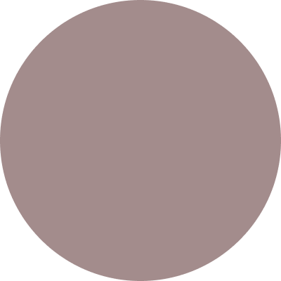
Dark Rose
#A38C8C
Typography
I used Google font’s open source typographies.
Poiret One
Designed by Denis Masharov, this Art Deco-inspired typeface is used for headlines and short paragraphs.
Playfair Display
Designed by Claus Eggers Sørensen, this typeface is used for the menu and logo.
Poppins
Combining the Devanagari and Latin writing systems, this typeface is used for long paragraphs and product descriptions.
UI & Users
End-user-oriented interface
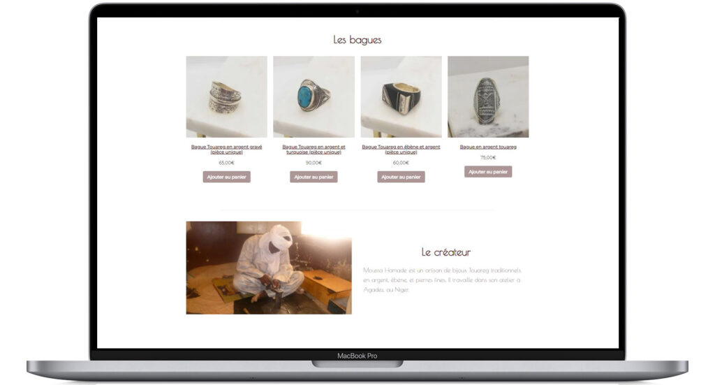
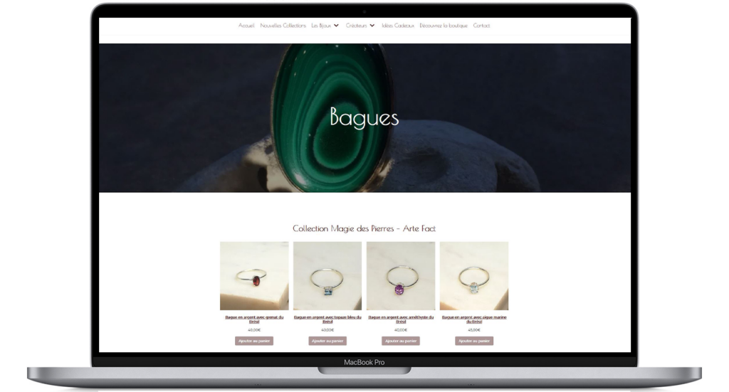
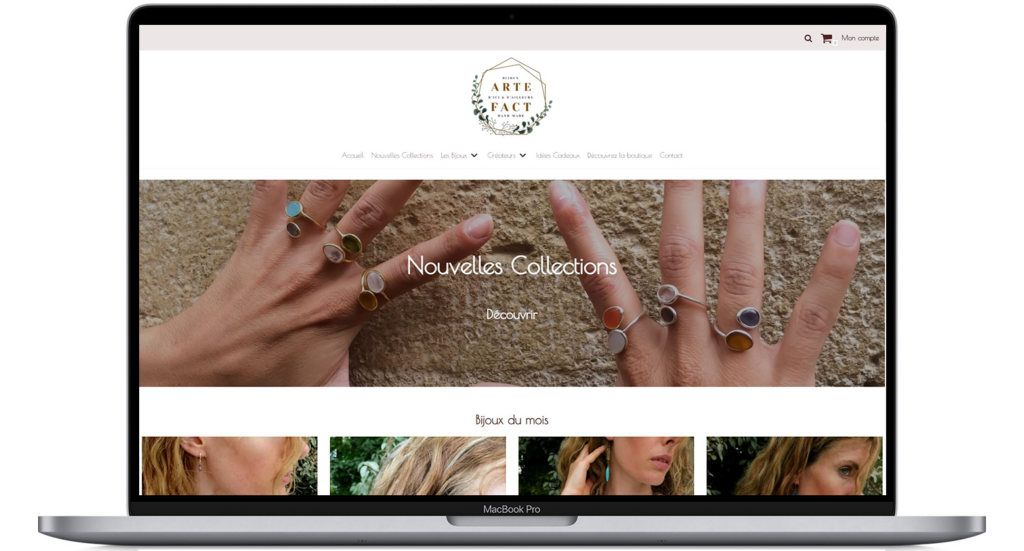
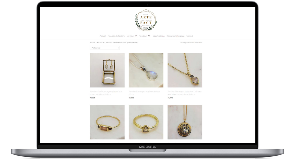
I designed the website’s interface to put the product at the heart of the project. 80% of the space is product photography: large image formats, banners, and presentation squares for the online store.
Arte Fact deployed a business strategy based on the products’ exclusivity, the jewelers’s know-how, and the quality of the creations.
I adapted the site’s structure and content to highlight the jewelry collections, related products, and creators. So, the website responds to the user’s needs: compare, find out, and buy.
UI
Responsive approach
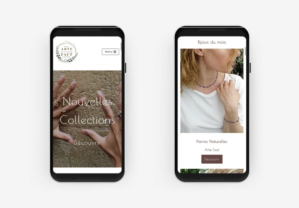
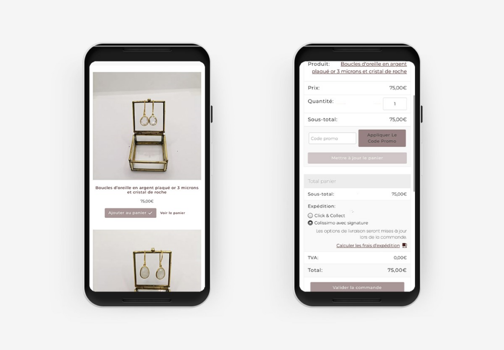
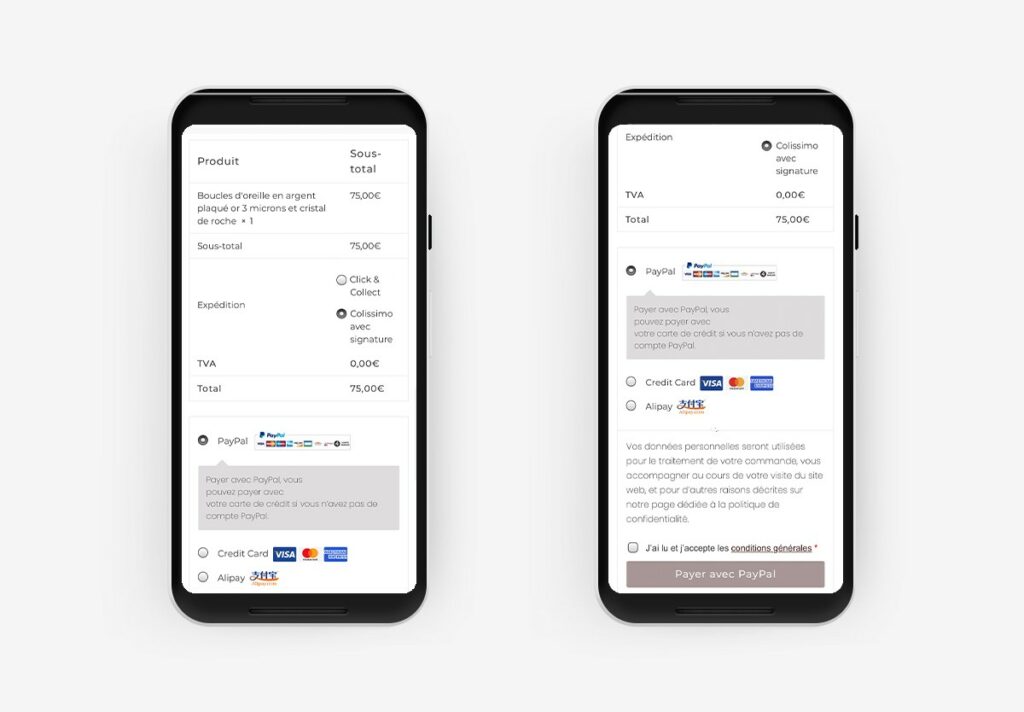
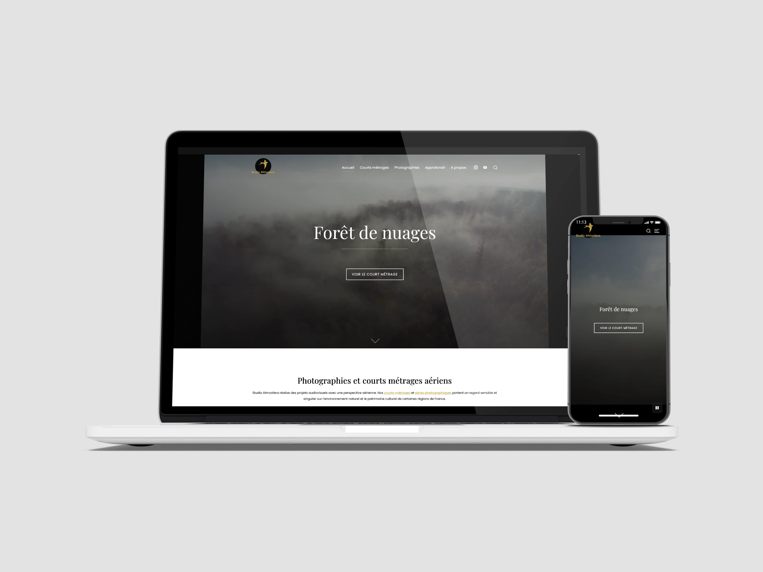
With 2/3 of traffic coming from mobile devices, it’s essential that the site is suitable for all devices and that users can make purchases on their smartphones. The mobile interface allows users to visit the e-commerce site while making secure online purchases.
e-shop
Design from user interface to payment tunnel
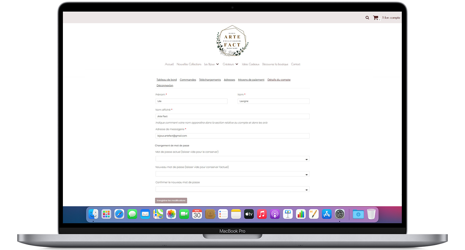
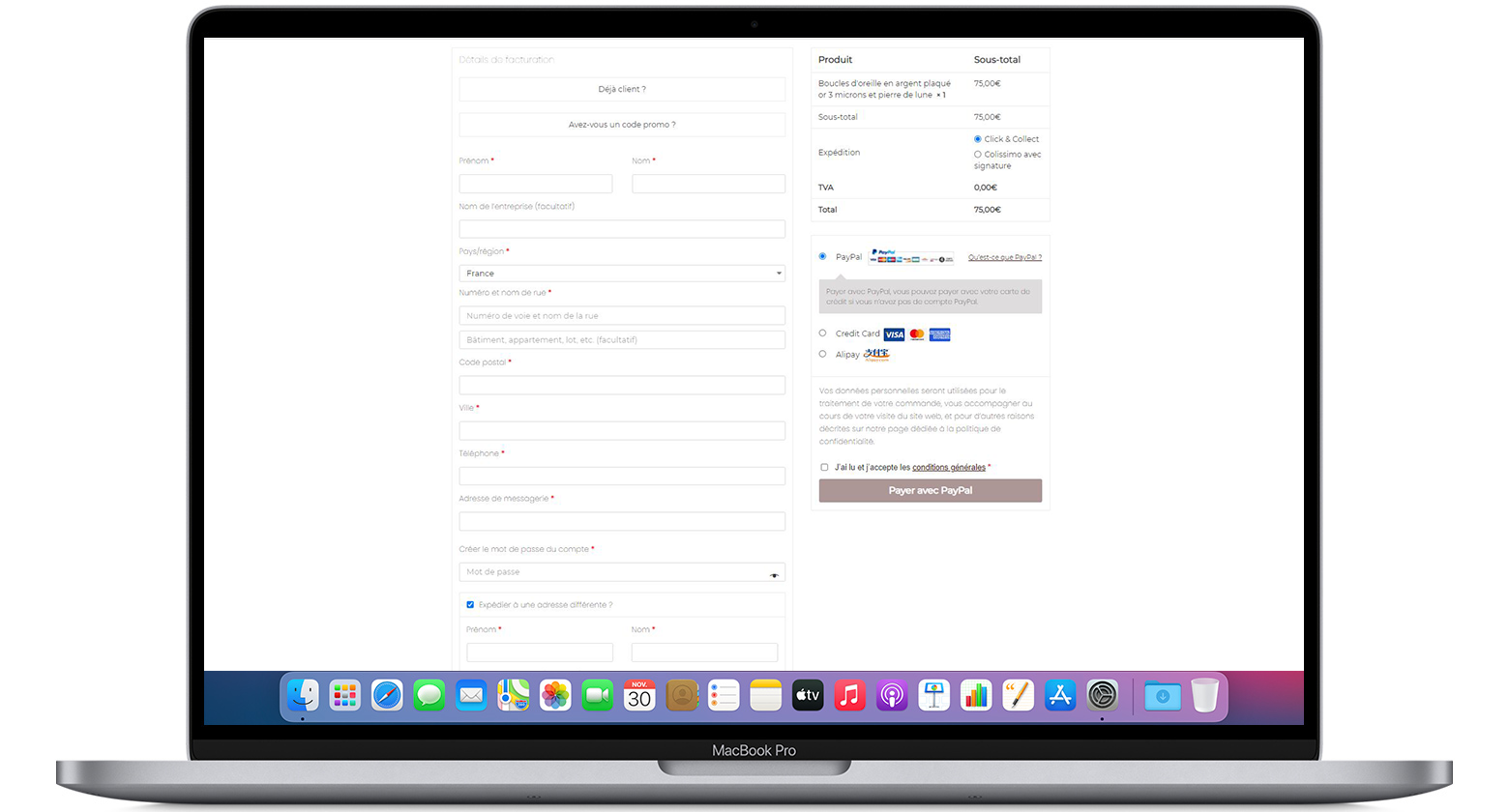
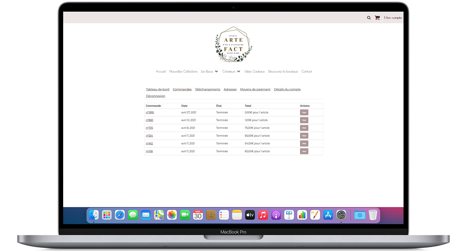
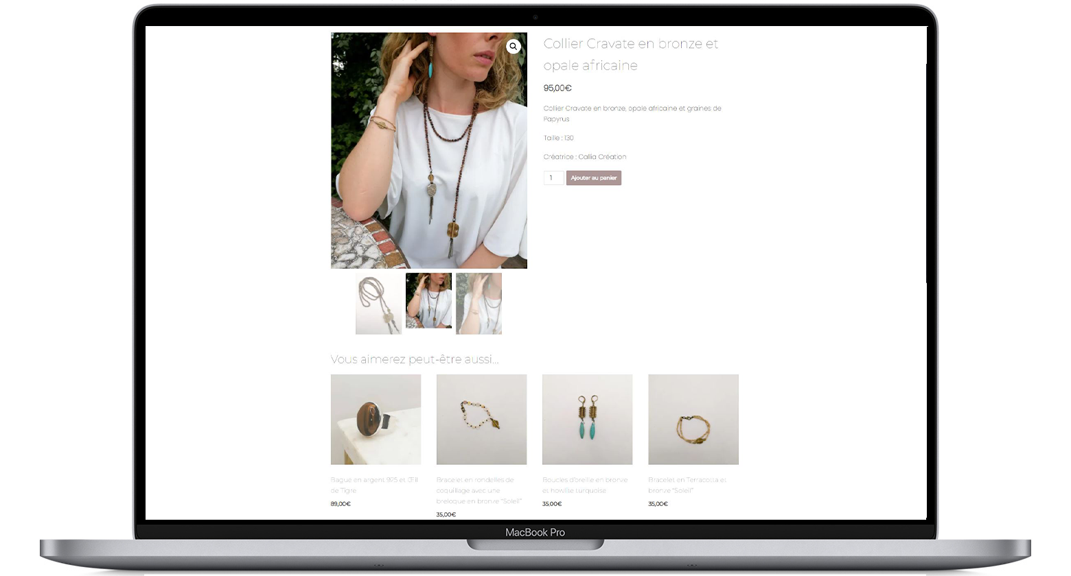
Users can easily add products to their shopping cart thanks to a call-to-action button under each item. An icon in the top right-hand corner gives direct access to the shopping cart and account. To complete the purchase, the user must log in or register.
Ideally, the user should wish to stay on the website, so I’ve added suggestions for similar products under each item, which can lead the customer to an alternative exit or itinerary.
