Design et création du site internet
Client
Juliette et Jacques Damville artists
Place
Bosc-Hyons
Project type
Website
Status
Completed
Date
Apr. 2022
Context
As they develop new projects, they have decided to redesign their website to enhance and promote their work.
Design
Visual identity
Colors
The color duo of gold and gray reflects the creativity of the artwork. In monumental sculptures, the artists use gold to represent stars, creating a play of reflections.
Primary Color
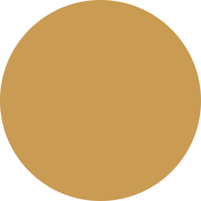
Toffee
#ca9b52
Secondary Color
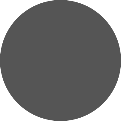
Davys Grey
#555555
Typography
Playfair Display
This elegant typography refers to literature and it’s used for the title and body paragraph.
UI & Users
User interface design
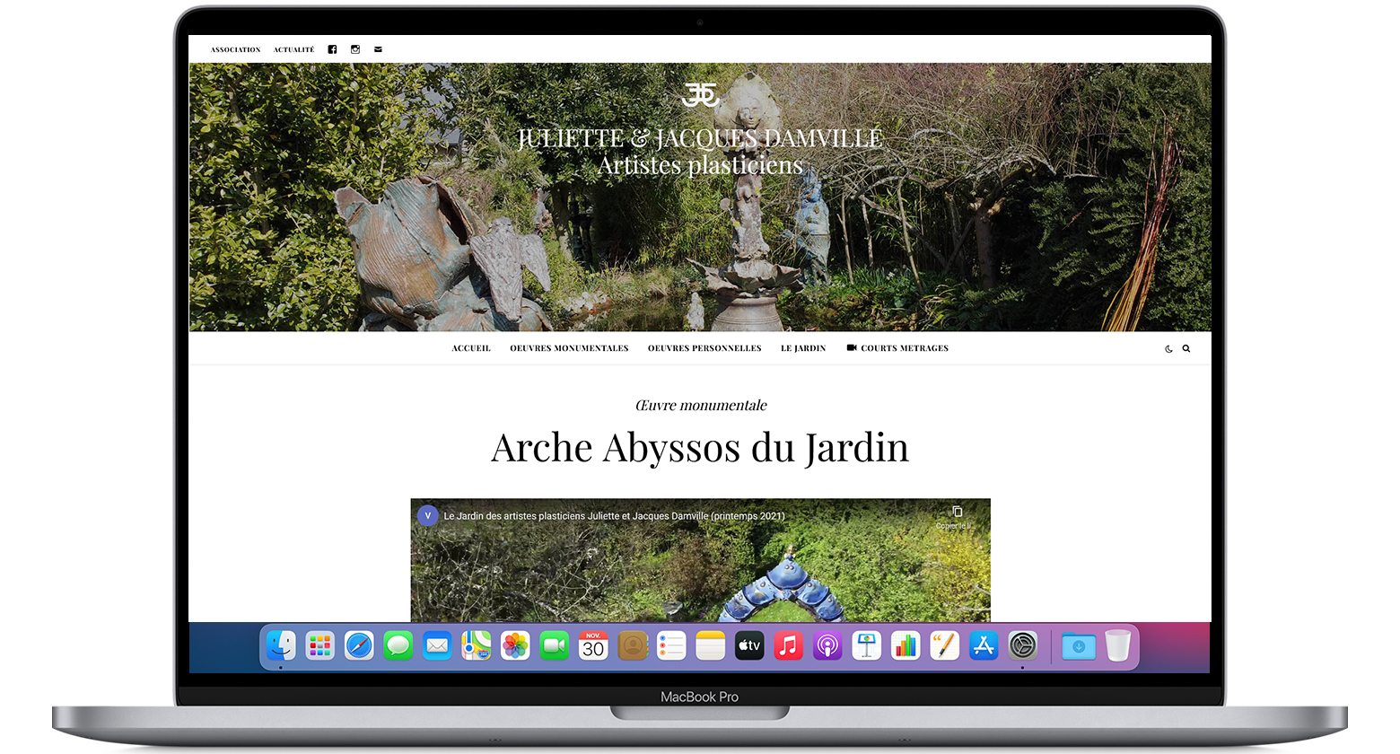
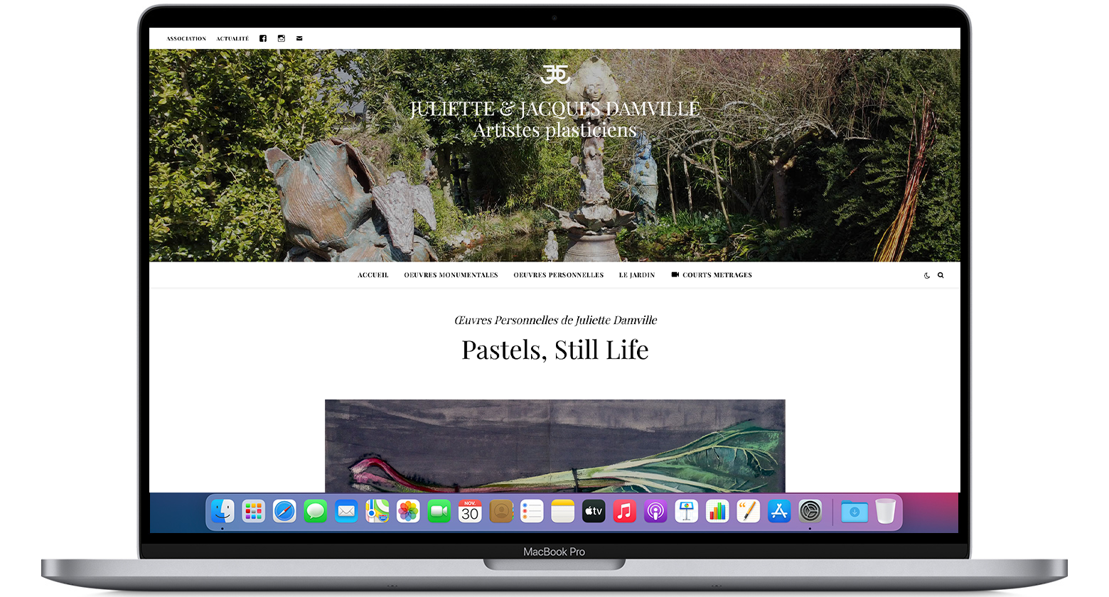
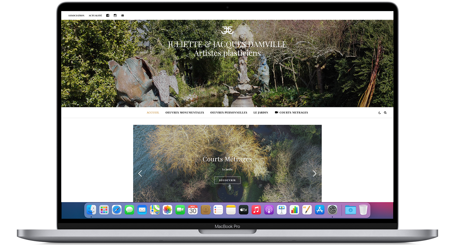
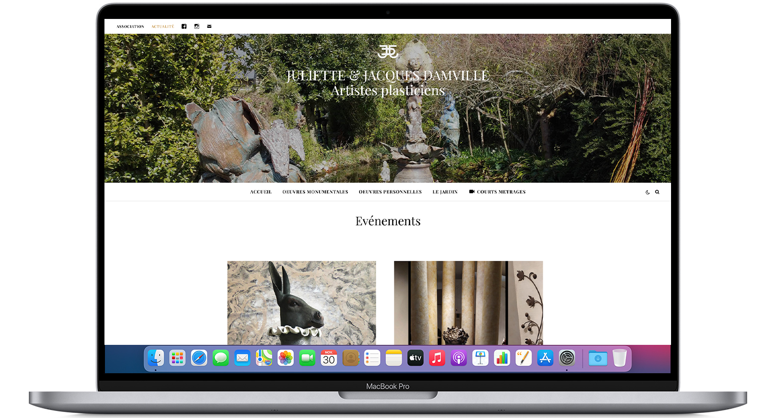
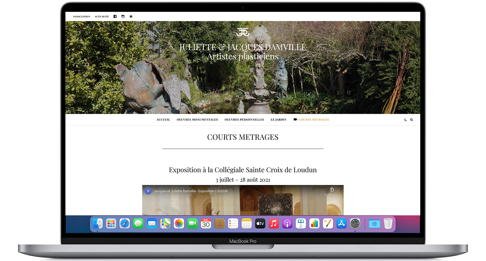
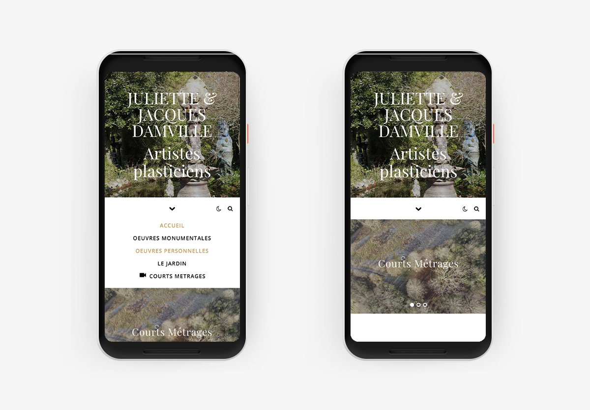
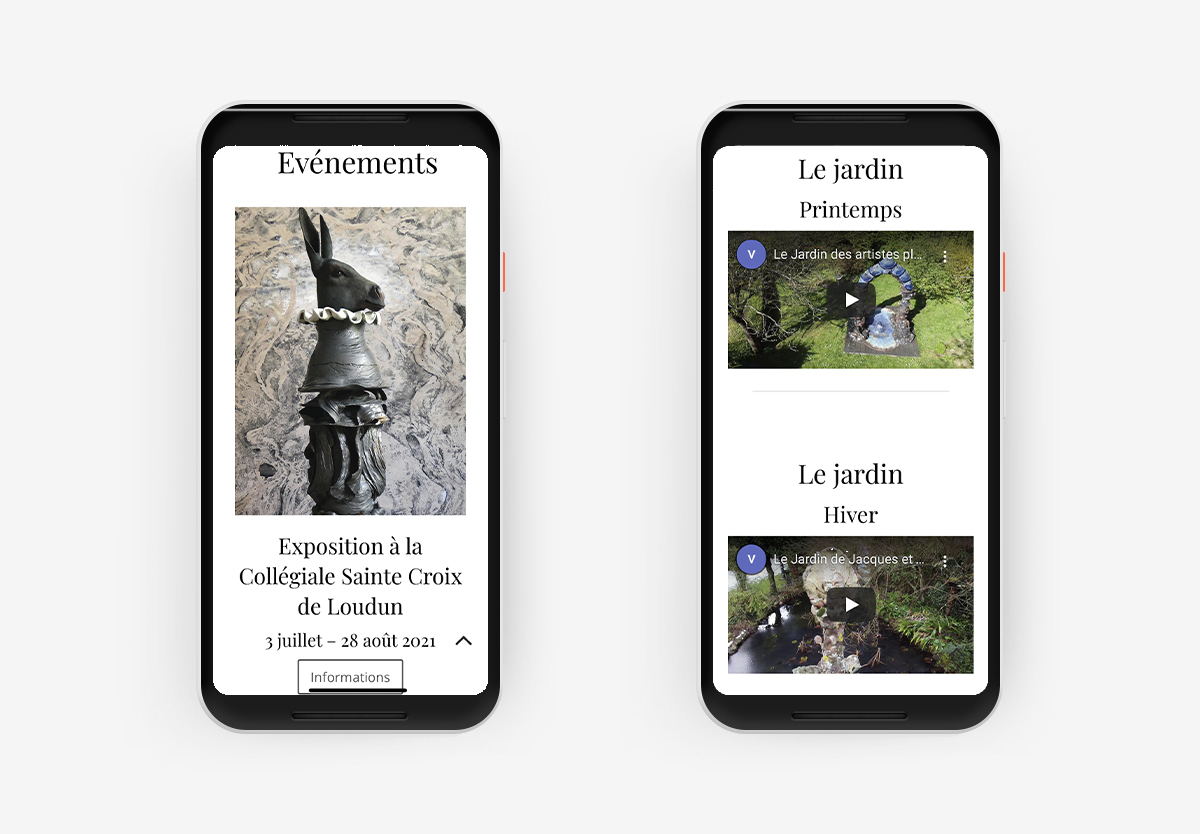
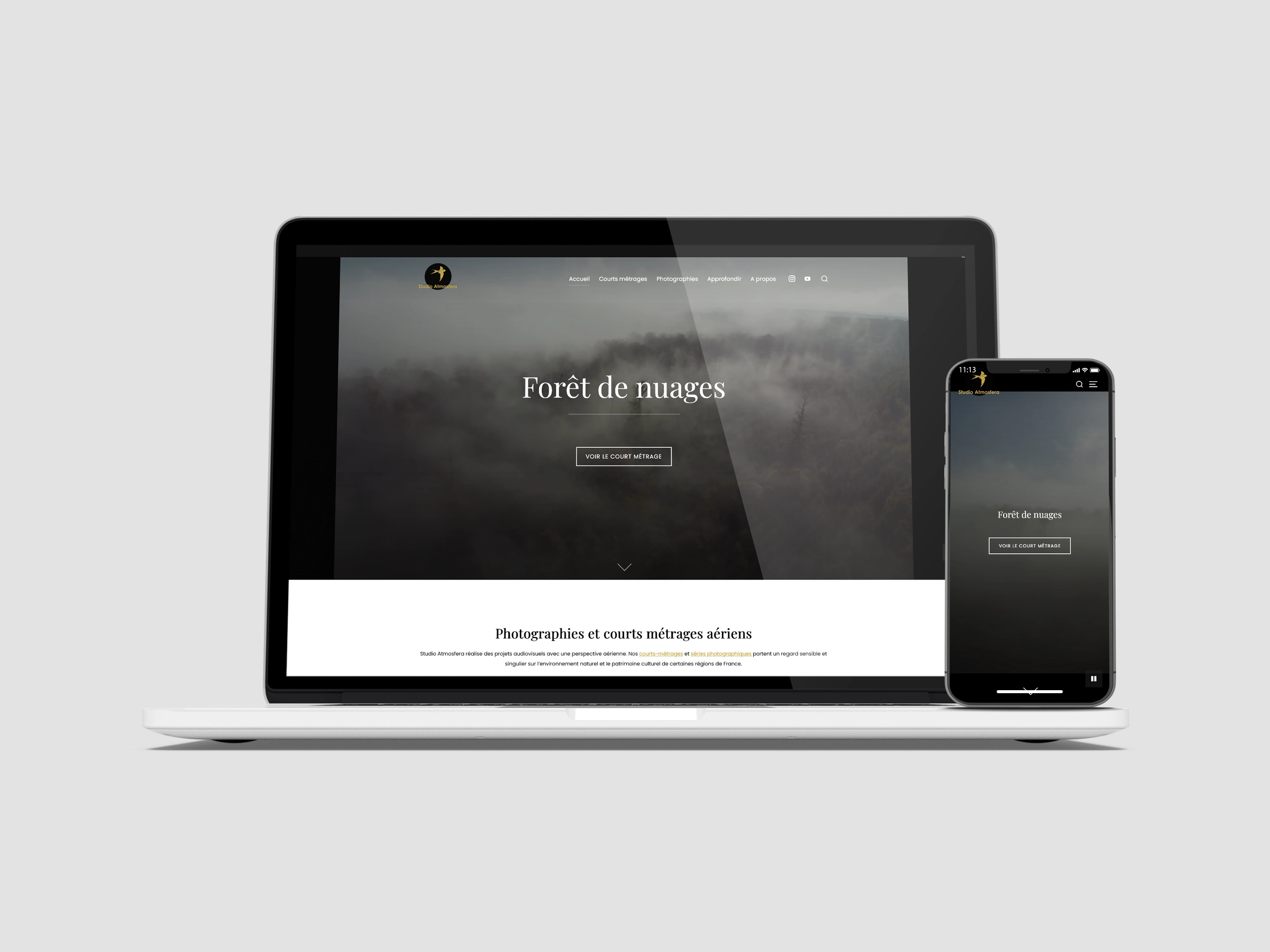
I proposed a flexible graphic design adapted to the artists’ objectives: highlighting short films on their works, exhibitions, and work. A top bar menu distinguishes the works from their related activities (Les Chemins de Traverse association) and their communication on social networks.
UI
Graphic Design
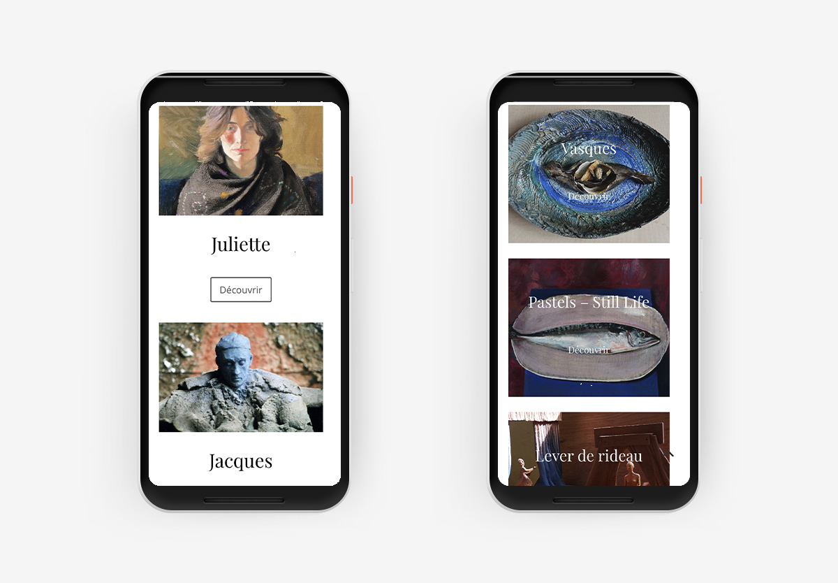
The graphic design of the pages and the site express the artists’ sensibility through intuitive, uncluttered ergonomics while integrating numerous themes.
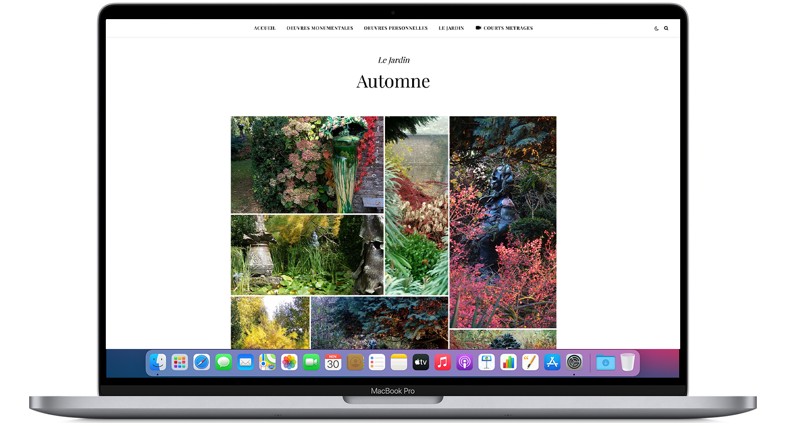
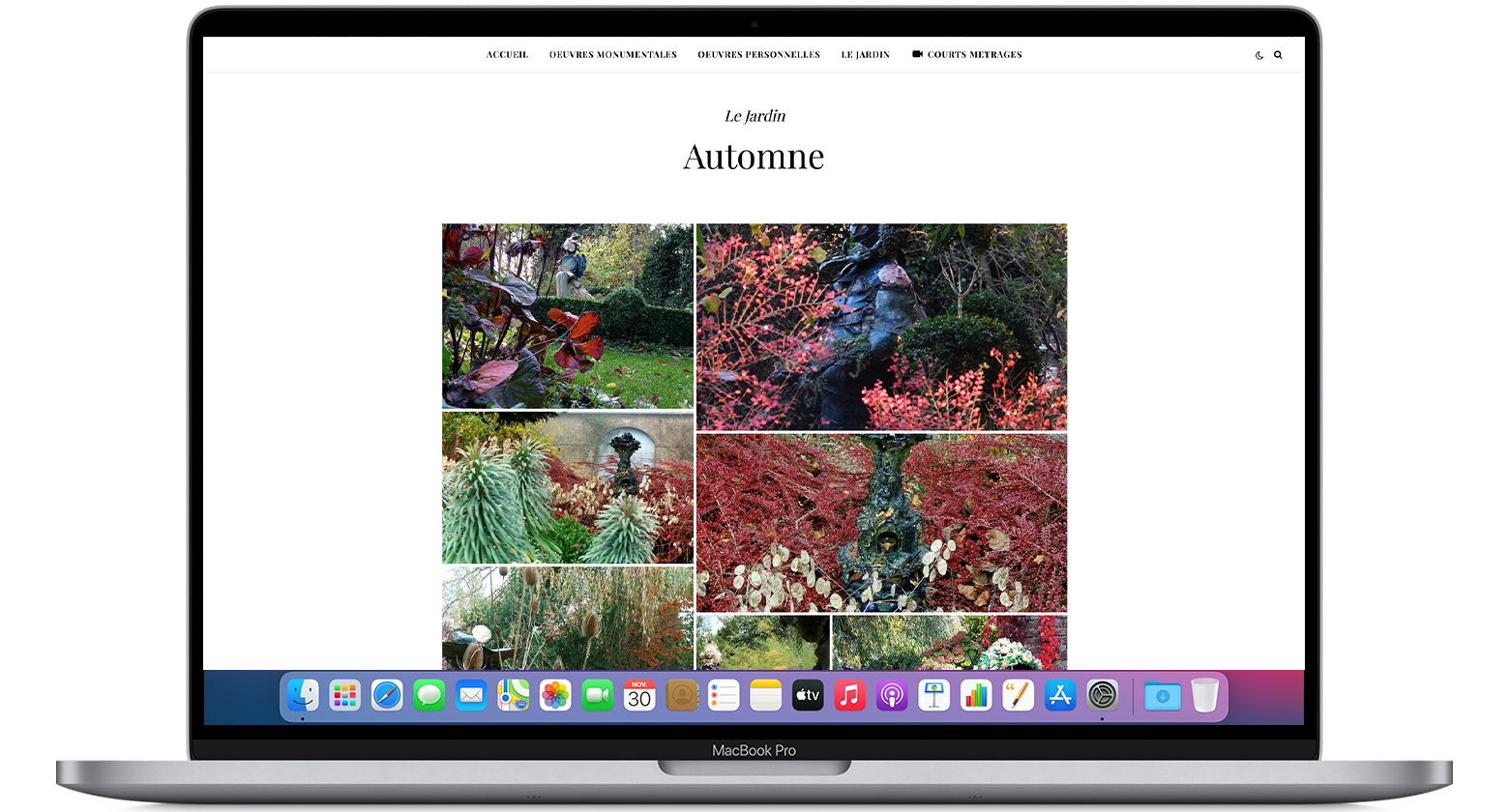
The galleries have been designed to convey the artist’s creativity. The organization of mosaics offers the user a global overview of personal and collective creations.
The work of the Damville artists is rich in detail and history, leaving the viewer free to interpret and appreciate. We chose a feature that randomly displays images of their works and gardens. It allows the viewer to have a renewed experience with each visit, discovering new aspects and details of the works.
UI
Responsive approach
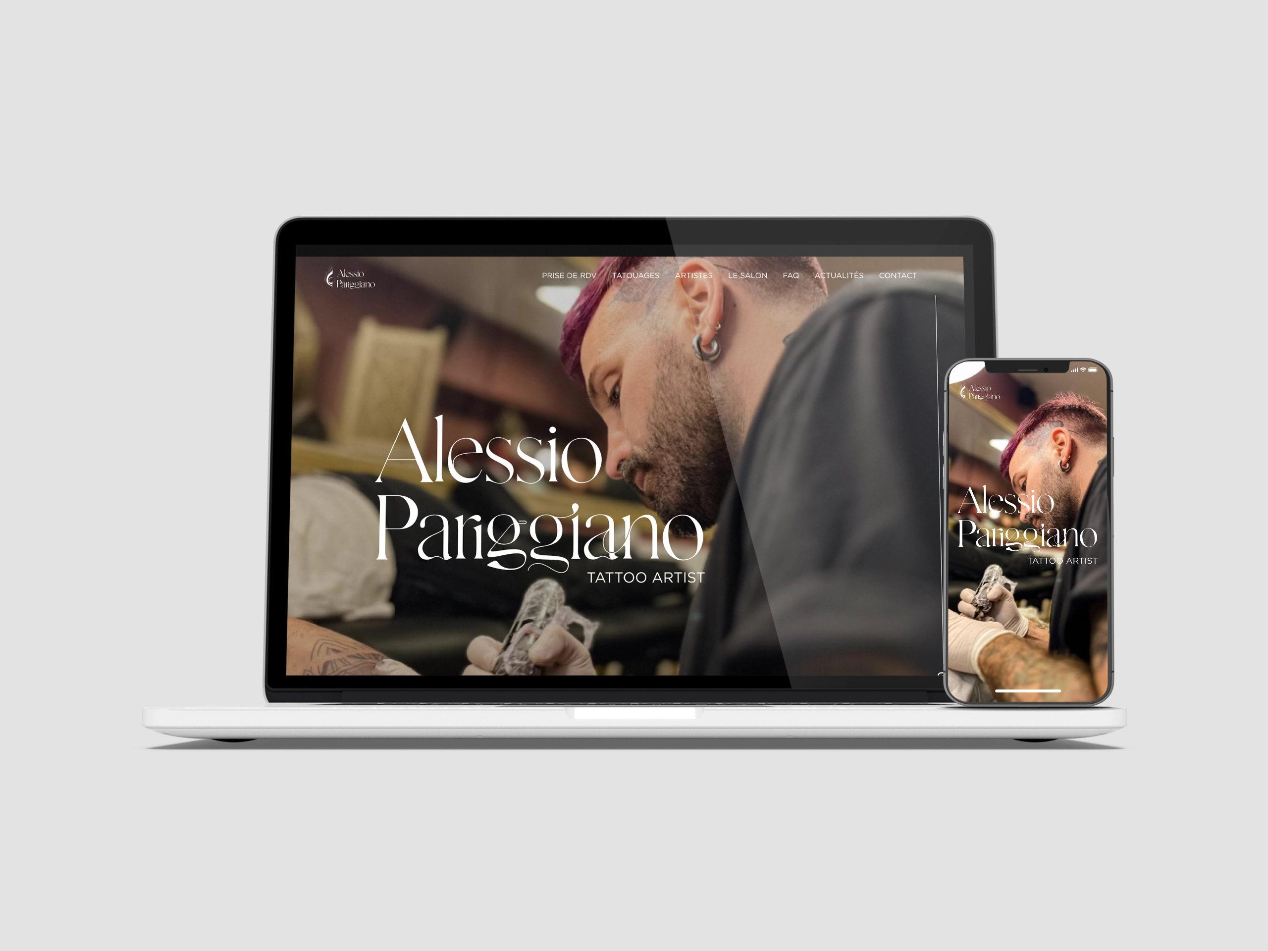
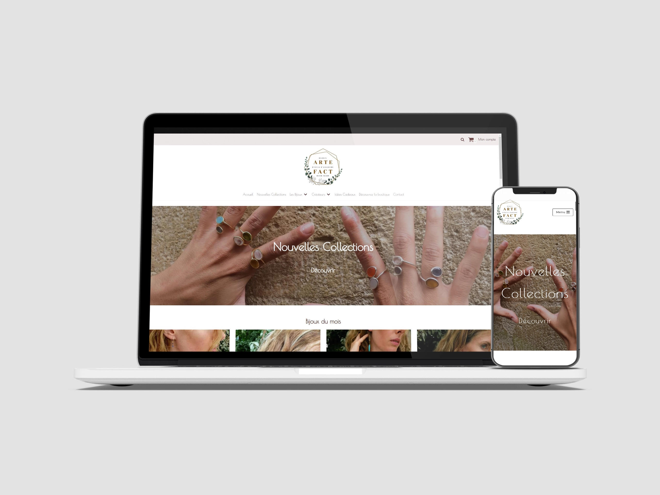
The website is responsive and offers a comfortable and pleasant visit to the user on all devices.
Artistic Director
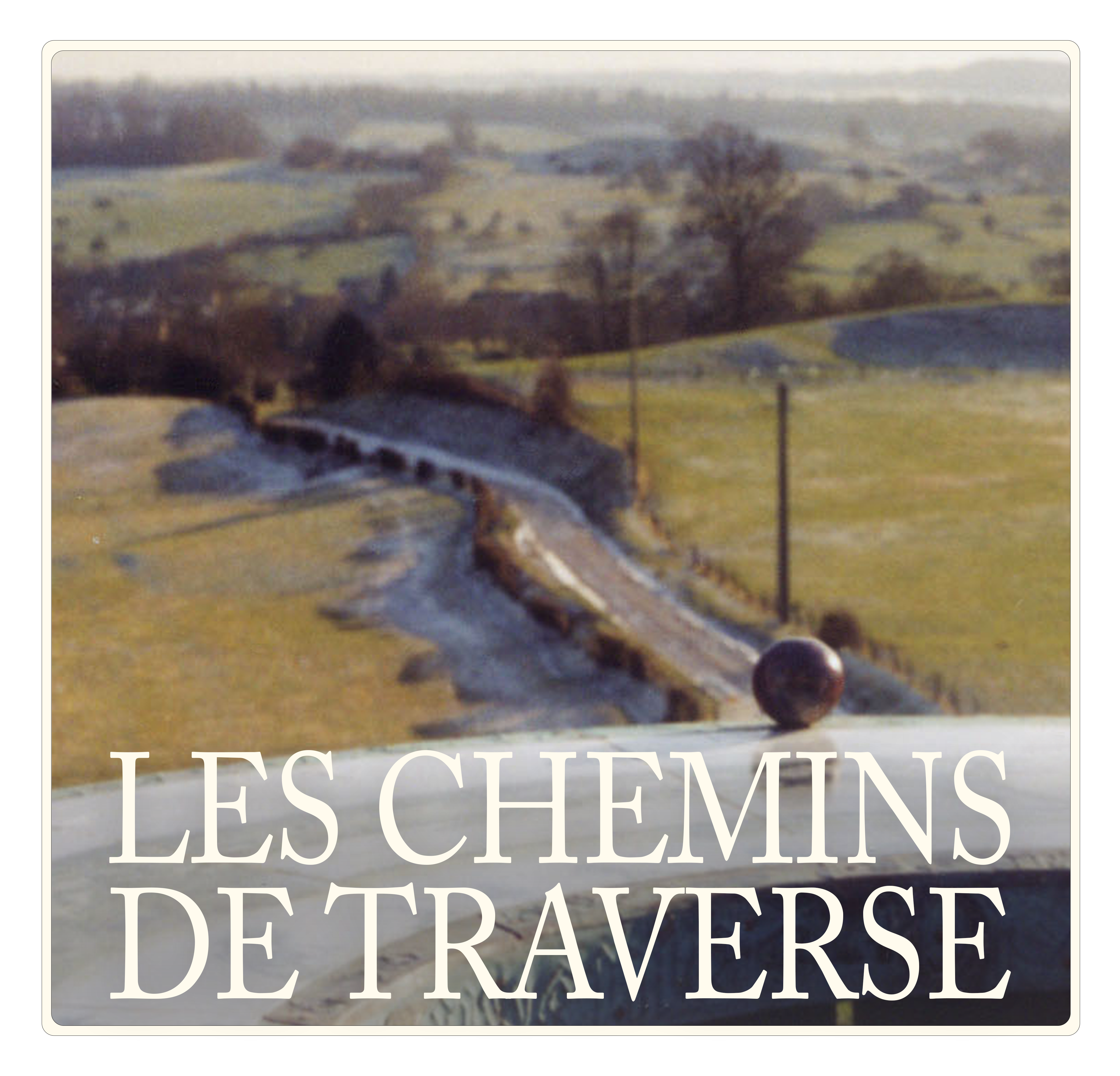
Les Chemins de Traverse association logo
The artists have set up the Chemins de Traverse association to carry out their ancillary activities, including workshops.
Versions
We used Adobe Photoshop, Illustrator, and After Effects to create the different logo versions.
Logo description
The logo depicts a Norman landscape, the panorama from the butte de la Ferté, where the artists built a viewpoint indicator. The original image is a photograph that was later digitized. This process gives the image a watercolor effect, in tune with the world depicted in the artists’ work. The sphere falls from the sky and rolls along the path until it reaches the Orientation Table. The image gradually emerges with the sphere’s movement, reflecting the creative process: starting from nothing, following a direction, creating a work of art.
Text
Colors
For the static logo
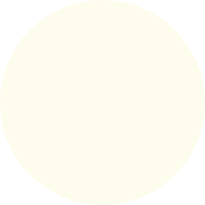
Light Yellow
#fefced
For the animated logo
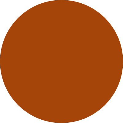
Deep Orange
#A6450A
Typography
Cormorant Garamond
Regular – 36px
