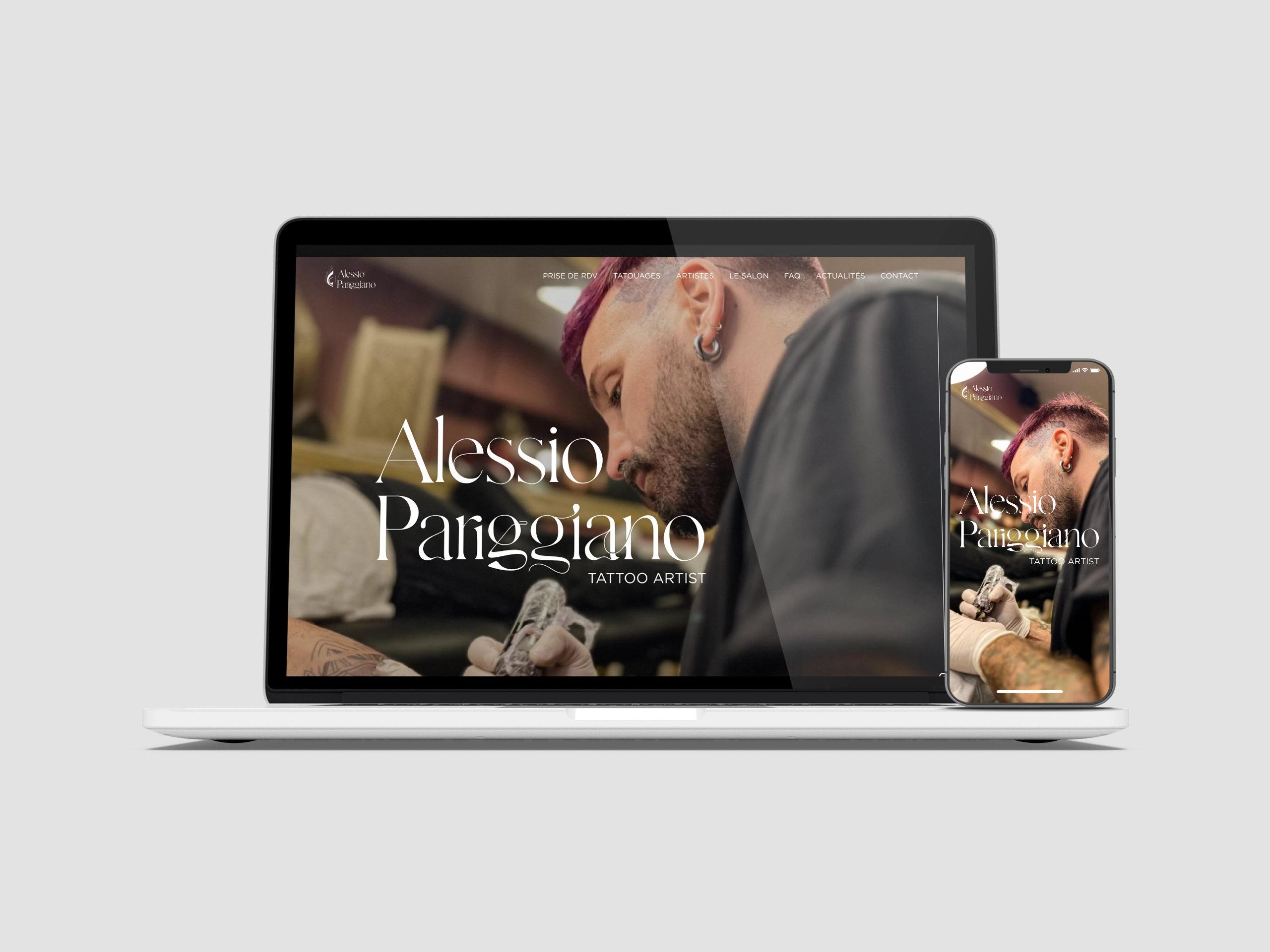
Design system of this website
A design system using Atomic Design allows the interface to be broken down into reusable and modular components, organized into five levels: atoms (basic elements such as buttons, colors, and fonts), molecules (groups of atoms like a search form), organisms (groups of molecules forming page sections), templates (structured layouts), and pages (assembled components creating concrete pages).
Atoms
Atoms
Atoms are the simplest and most fundamental interface components. Together, these atoms form the essential building blocks necessary for creating a visually cohesive interface while ensuring a smooth and enjoyable user experience. Due to their reusability and uniformity, they help maintain a harmonious aesthetic and simplify the development process by enabling centralized and streamlined management of visual elements.
Using Variables for Colors in Figma
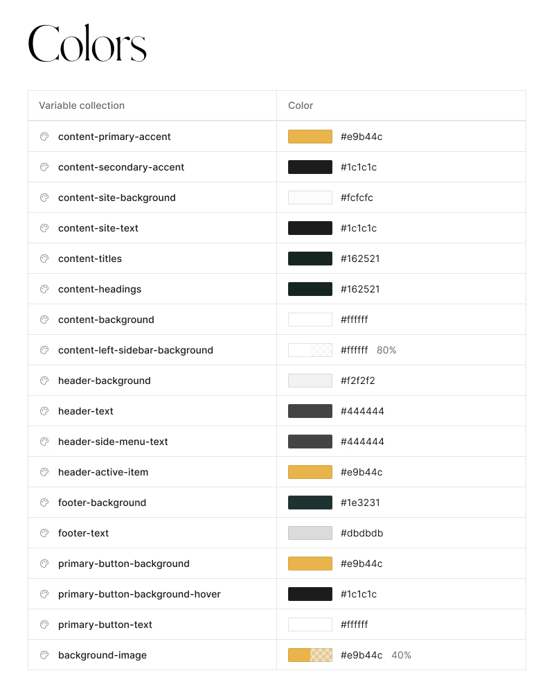
In Figma, using variables for colors centralizes and streamlines the management of a design system’s color palette. By creating color variables, designers can define specific shades for different purposes (such as primary, secondary, background, or text colors) while ensuring visual consistency throughout the project.
These variables are especially useful for applying global adjustments, as any modification to a color variable automatically updates all elements using it, making updates and design maintenance easier. Additionally, Figma allows the creation of dynamic variables based on interaction states (e.g., hover or active colors), enabling finer, context-aware color management.
Creating Text Styles
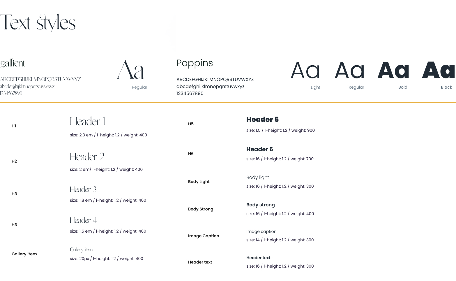
Creating text styles in Figma helps standardize and simplify typographic management within a design system. By defining predefined text styles—such as titles, subtitles, paragraphs, or captions—designers can ensure typographic consistency throughout the project. Each text style includes specific properties like font, font size, line height, weight, and alignment, providing a uniform framework for typography usage.
The primary benefit is the ability to modify a text style globally: any update to a text style is automatically applied to all elements using it. This facilitates last-minute adjustments, changes in visual hierarchy, or adaptations for responsive design.
Buttons as Atomic Components
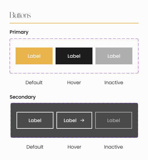
Buttons are the main interaction points for users. As a key interface element, they must be designed with consistency and flexibility to adapt to various usage contexts.
A button should incorporate principles of accessibility, readability, and visual hierarchy while adhering to the colors, typography, and spacing defined by the Design System. It can exist in multiple variants (primary, secondary, text, icon, disabled, etc.) and states (normal, hovered, pressed, disabled), each catering to specific interaction needs. Through modular and systematic design, buttons ensure a consistent user experience and facilitate the maintenance and evolution of design within a digital product.
Logo Variants
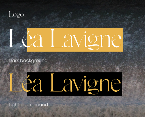
Logos represent a brand’s visual identity in a consistent and recognizable manner. To ensure adaptability across different contexts, they must be designed with variations suited for light and dark backgrounds. A colored or dark version is used on a light background, while a light-toned version is preferred on a dark background to ensure optimal contrast and readability.
These variations can be defined as variables within the Design System (e.g., logo-light for dark backgrounds and logo-dark for light backgrounds), making their integration into digital interfaces easier and ensuring visual harmony across all platforms.
Molecules
Molecules
In Atomic Design, molecules are intermediate components formed by combining multiple atoms, creating functional and reusable interface elements.
Media placeholder
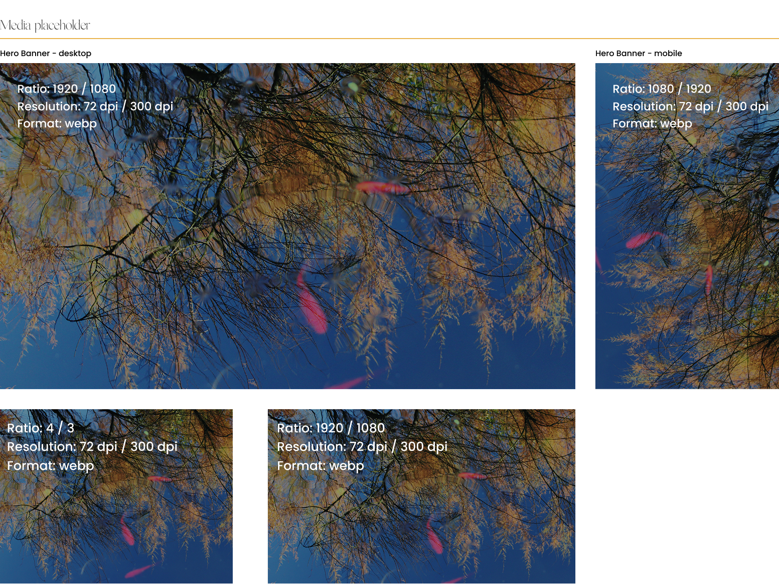
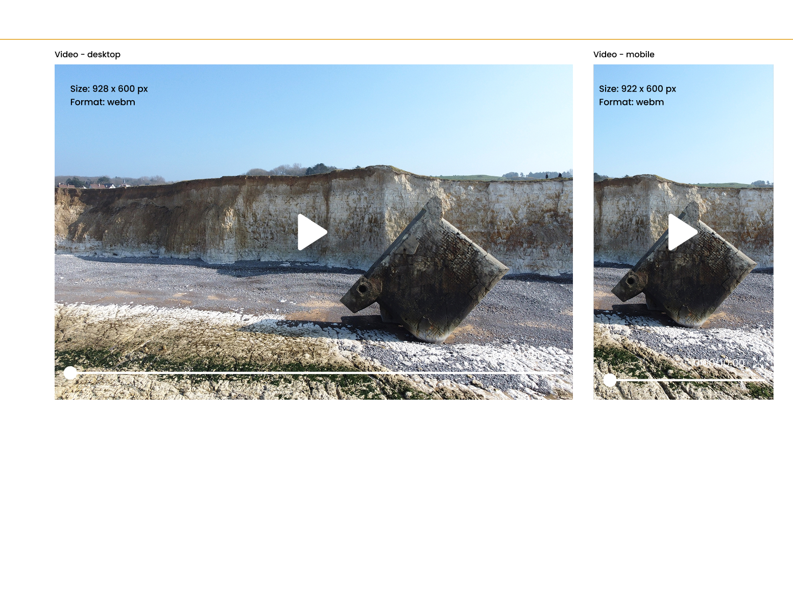
In a Design System, creating molecules involves assembling multiple atomic components to form more complex and functional elements. Among these molecules, media placeholders (images and videos) play a key role by reserving space for visual content, ensuring a harmonious layout while awaiting media uploads. They can include icons, placeholder text, or animations to enhance the user experience.
The adaptability of these components in responsive design is crucial to ensure a consistent experience across all devices, whether desktops, tablets, or mobile phones. Through modular and flexible design, these elements dynamically adjust to different resolutions and touch interactions, reinforcing the coherence and effectiveness of the Design System.
Tab List
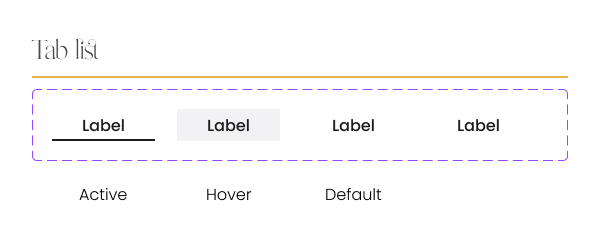
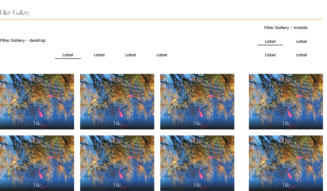
Tabs lists provide intuitive navigation by segmenting multimedia content into categories or filters, improving exploration and information accessibility.
Organisms
Organisms
In a Design System, organisms are combinations of molecules and atoms that form complete and functional sections of a user interface.
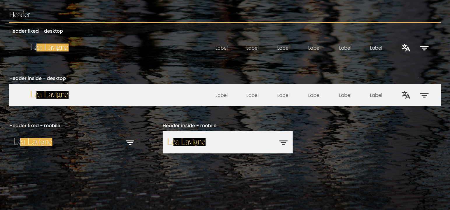
Header
The responsive header is a crucial element of the user interface, serving as the primary access point for navigation and key interactions on a website or application.
Gallery
A responsive image gallery is a key component of a Design System, allowing visual content to be displayed fluidly and adaptively across all screen types. Designed with a flexible grid, it dynamically adjusts the number of columns and image sizes based on the device resolution. On desktops, it can display multiple high-resolution images with interactive effects (zoom, hover, animated captions), while on mobile devices, it prioritizes optimized touch navigation, using a sliding carousel or single-column layout for better readability. A well-designed gallery should also include filters and tab lists to organize content, as well as progressive image loading to optimize performance and user experience. By ensuring a seamless and consistent experience across all platforms, a responsive image gallery enhances engagement and accessibility of visual content.
